Creating a cohesive visual language for any educational platform takes serious effort. Product cycles shift constantly during a typical six-month sprint. Initial plans might only cover core interfaces. Suddenly, your development team demands graphics for ten empty states, a password reset flow, and multiple success modals.
Picture a rainy Thursday right before a major beta launch. I once watched a brilliant product team discover their newly coded student dashboard felt incredibly sterile. Code worked beautifully. Visual warmth didn’t exist. Bringing on a freelancer at that exact moment wasn’t an option. Briefing an artist, waiting for sketches, and running feedback rounds won’t fit a tight sprint timeline. High-quality graphics had to appear immediately.
Startup product cycles force hard choices. Teams must decide between commissioning original art or leaning heavily on pre-made assets.
Table of Contents
The Six-Month Cycle: Freelancers Against Asset Libraries
Hiring a freelance illustrator guarantees a completely unique brand identity. Artists build bespoke worlds tailored exactly to your specific educational niche. Custom illustrations elevate standard interfaces into memorable digital experiences.
Speed and scalability become the main trade-offs. Every new feature demands another commission. Marketing teams wanting a matching newsletter graphic for a weekend campaign remain entirely dependent on an illustrator’s availability. Waiting days for a single hero image slows down development velocity.
Turnaround times can kill momentum.
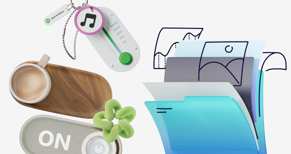
Startups often turn to stock libraries to bypass these bottlenecks. Mixed results usually follow. Tools like unDraw offer fantastic, quick solutions for flat vector graphics. Unfortunately, that distinct style appears everywhere, instantly making products look like generic templates. Humaaans provides excellent mix-and-match character creation. Missing technical objects and interface metaphors makes it useless for complex platforms. Freepik holds millions of assets. Combining work from dozens of different contributors rarely works. You just end up with a chaotic, disjointed interface. Inconsistent line weights and clashing color palettes ruin user trust.
Ouch, a library built by Icons8, tackles the problem differently. Thousands of professional illustrations sit neatly organized into 101 distinct styles. Structuring files this way directly solves the biggest weakness of standard stock graphics. It preserves a coherent aesthetic across your entire user experience. Developers can pull graphics knowing everything matches perfectly.
Populating a Complete User Flow
Working with Ouch requires a very specific workflow. Searching for individual concepts right away rarely works well. Locking in a single visual style for the entire platform must happen first. Style selection dictates the entire product mood.
Adult learners using an edtech app generally don’t respond well to bold, colorful surrealism. They prefer a sketchy, monochrome look instead. Selecting a specific style from the catalog let us tackle the core user flow strategically. Replacing sterile text warnings with engaging visuals became our main objective. Empty states suddenly transformed into helpful onboarding moments.
We needed assets fast. Login pages, course catalog empty states, 404 errors, and successful checkout screens all required visuals. Finding matching scenes for every scenario felt effortless because Ouch styles natively cover full user experience flows. Missing error state graphics didn’t delay our sprints anymore.
Standard vector clipart dropped directly into our design tool. Upgrading to the Pro plan unlocked the raw SVG formats. Stripping out default shading became a simple click. Applying our exact brand colors directly to the vector paths guaranteed these pre-made graphics felt natively integrated into our proprietary interface. Customizing vector nodes took mere seconds per file.
Assembling Unique Scenes for Lesson Content
Launching a product is only half the battle. Educators and content managers desperately need graphics for course headers, blog articles, and email campaigns. Engaging the student base requires constant visual updates. Static platforms lose active users quickly.
Pre-made scenes only go so far. Marketing folks tapped into the searchable object system within Ouch instead. Tagged, individual elements break down layered vector graphics into usable pieces. Building composite images keeps marketing materials fresh.
Content managers building basic coding modules didn’t have to settle for generic “person at laptop” setups anymore. Mega Creator, the free online editor from Icons8, empowered them to build custom compositions. Browser-based tools eliminated the need for complex design software.
Blank canvases fill up quickly. Drop a desk object from the technology category to set the scene. Bring the composition alive by adding an education character. Arrange these elements to fit the exact aspect ratio of any course header. Hit export. Illustrating specific lesson concepts suddenly requires zero custom drawing skills. Complex topics get clear visual explanations instantly.
Where Standardized Assets Hit Their Limits
Pre-made libraries can’t entirely replace skilled illustrators. Ouch beautifully solves high-volume consistency problems. But boundaries definitely still exist. Knowing these limits prevents project delays.
Highly specific, recurring characters present a real challenge. Stock libraries might offer ten variations of a generic teacher figure. Getting that exact same mascot in fifty different specific poses won’t happen. Interacting specifically with your proprietary software interfaces goes beyond standard asset capabilities. Custom brand mascots still require dedicated artists.
Category depth varies wildly. Over 28,000 business and 23,000 technology illustrations cover most general needs. Niche subjects like complex healthcare procedures or advanced industrial mechanics suffer from fewer options. Drawing a surgical tool might require combining multiple basic shapes.
Format availability presents another minor hurdle. Platform features include 44 different 3D styles in FBX format, plus animated files in Lottie JSON and Rive. Those specific collections are still growing compared to the massive flat vector catalog. 3D integration demands more technical overhead from development teams.
Free tiers come with strict limits. Downloading PNG formats is the only option without paying. Linking back to Icons8 anywhere the image appears is non-negotiable. Professional product interfaces demand the Pro upgrade to access editable SVGs and permanently drop that attribution requirement.
Executing a Cohesive Visual Strategy
Fast-paced development cycles demand discipline when integrating extensive asset libraries. Cluttered end products happen easily. Implementing strict rules keeps the design system clean.
- Install the Pichon desktop app to completely bypass the browser. Every single illustration lives inside, letting you drag and drop assets straight onto your digital canvas. Offline access speeds up the entire layout process.
- Restrict your team to a maximum of two complementary styles from the 101 available options. Aesthetic consistency across your entire platform depends on strict constraints. Mixing too many styles breaks the professional illusion immediately.
- Download SVG files when designing interfaces. Recoloring assets to match your specific brand hex codes makes standard stock art feel completely proprietary. Matching button colors to illustration highlights ties the whole screen together.
- Take advantage of rolled-over credits. Quiet months happen. Unused downloads carry forward to the next billing period automatically. Stockpiling assets for the next major feature push becomes effortless. Planning ahead saves budget during heavy release cycles.
Building an engaging educational platform without a dedicated illustrator works perfectly. Treat a structured library like a scalable design system rather than a random image dump. Startups can easily maintain exceptional visual quality from that very first login screen all the way down to the final marketing email. Smart resource management beats endless design budgets every time.